I’ve been interested in getting (or making) a white box for a while. The effect it has on pictures is just gorgeous.
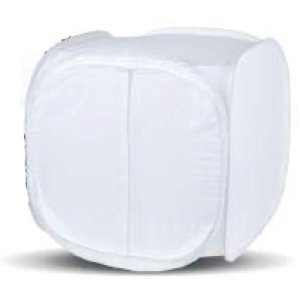
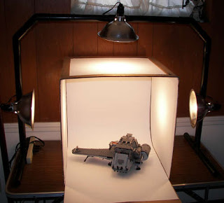
It’s basically a mini white tent with filtered lighting.
I’m sure you’ve seen the picture – we all have ’em. The obnoxiously over flashed, too close, cluttered background photos.
I think the worst is when someone takes a shot of a dish WAY too close with the flash. It can make an otherwise yummy recipe look like something out of a cheap diner trashcan.
The white box is a mini studio. Some are small enough to set up on a desk or table.
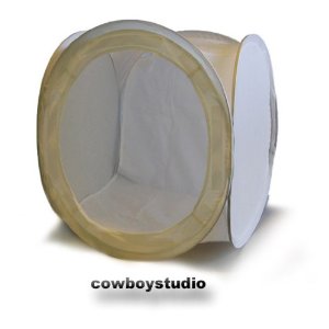
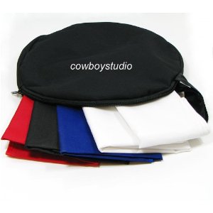
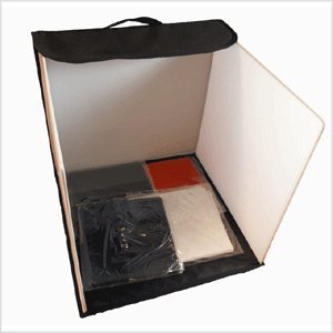
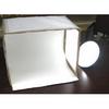
This is a pop-up model from Cowboy Studio .
.
This light box comes with two lights.
It’s a great tool if you’re selling items on ebay or if you have an etsy shop.
Here are a few DIY tutorials with lots of pictures:
Wikihow
ehow
Instructables.net
It’s also a great idea as a gift for a blogger!
Hey Sarah I have been meaning to make one of these too but I never have "time" but it would be SO much better for my etsy stuff! Cowboy studios is where I ordered my lights and backdrops from! They shipped really fast too.
Why just by reading a few of your blogs I've learned to vacuum the back of my refrigerator (this weekend, I promise!) AND I'll probably gain 5 lb from just reading your sweets posts.
I guess that means I have to follow!
I have learned so much about taking photos of food since starting my blog. Food is so hard to capture. I NEVER, EVER use a flash. I wish my little point and shoot didn't even have a flash.
I can't do without PhotoScape..it's such a great place to "play" with your photos.
I've also learned that ALL food looks better on a white dish. Guess Better Homes and Gardens knows a thing or two. :))
I am new here and anxious to go back and read some of your older posts.
Come by to see me sometime..I nearly ALWAYS have FOOD. :)))